OPTIONS CZAR EXAMPLES
Loading data from the web
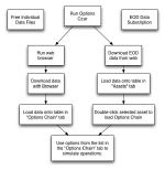
| Options Czar can read data from two sources: the Stricknet web site and directly from the CBOE web site. The former contains the End-Of-Day data for all the options that are traded in the CBOE, along with the data from their underlying assets. The diagram at right explains how data is read into Options Czar from the two available sources. The path at left represents the single CBOE web site data file entry which is explained below. |
 |
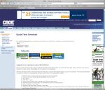
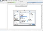
| The first step for loading free 20-minute delayed data from the CBOE web site is to visit the site. The current link is the following. Once the link has been clicked, your browser should show a page like in the image to the right. The next step is to introduce the symbol for the underlying asset that we wish to work with. In this example, we will use the S&P500 index, which has a very liquid options market. We type the SPX symbol where indicated and click on "Download". Note that this page will download the full options chain. |
 |
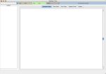
| Next, we run Options Czar and open a new Portfolio window. It should be empty and look like the one in the screenshot at right. |
 |
| We select "Load CBOE Data from Disk" and then use the menu (or the Down arrow button) to select "Single CBOE file" and press "OK". A new window will open in which we will need to locate the file we just downloaded and select it. |
 |
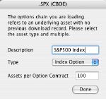
| Since it is the first time we load this options chain, Options Czar will ask us some additional information regarding this asset. We enter the description in the appropriate slot, along with the information that this is an index option as in the screenshot to the right. |
 |
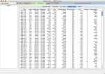
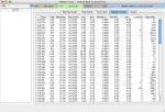
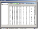
| Once the previous step has been done, we can see the full options chain when you click on the "Chain" tab as in the screenshot to the right. |
 |
Creating and Viewing Options Strategies
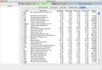
| This example has a (pretty extensive) movie that you can download here. The first step involves using the options data to create a combination of stock and options operations also known as strategy. In this case, we will create a collar, which a stock owner can use to limit the losses in case the price drops below the current price. The screenshot at right shows the list of assets that can be chosen when using the end-of-day data. |
|
 |
| The next step is to double-click one of the assets from the list in the Assets tab. This will load all the options for the selected asset into the table that is located in the "Options Chain" tab. If you are working with the single-asset files from the CBOE web page, then you will not see the list in the Assets table but the data will be loaded in the chain table, instead. |
|
 |
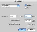
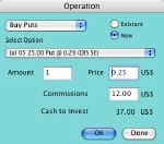
| The first operation involves purchasing stock to simulate the shares that are already owned. You can open the operations window by selecting "Purchase Stocks" from the Tools menu and then click "OK". In this case, we didn't take into account the commissions in the calculation. We selected 100 shares because it is the amount of shares per options contract and the options strategy will work best in this way. |
 |
 |
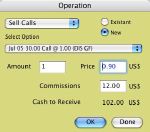
| The collar strategy consists in owning stock, selling a call and buying a put, both out of the money. Hence, we still need to sell the call (with a strike price that is higher than the asset price) and purchase a put (with a strike price lower than the asset price). Within the same operations window, we select "Sell Calls" and then the specific call and click "OK" and then "Buy Puts" and then the specific put and click "OK". Please note that each operation involves one contract. |
 |
 |
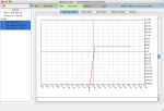
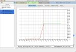
| After clicking "Done" in the operations window, you will notice that all three operations can be found in the table in the left side of the window. Clicking on the "Exercise Chart" tab will show a blank drawing like the one in the first screenshot to the right. The next step is to select the first operation which is the stock purchase. Note that the Exercise chart changes to a line that shows profits for this operation. |
 |
 |
| The next steps start getting more interesting: as we keep the shift-key pressed while selecting the call sale, we see that the right end of the curve flattens as the stock profits are compensated by the losses from the need to repurchase the call at a higher price. When we select the put option, we see that the stock losses are compensated by the increase in the put value as the price drops. |
 |
 |
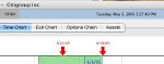
| Hence the purpose of this strategy: limit losses and provide a quicker return than the protective put (a collar without the call sale). Moving the scale bar (at right of the drawing) down will show the bottom of the curve. If we select the Time Chart tab, we can see that the breakeven point for a collar is lower than the point for a protective put given that the call sale provides cash upfront. |
 |
 |
Using the Time Chart
There are three chart types in Options Czar. Two of them present profits and losses at a given point in time and the third presents profits and losses areas as a function of time. This last chart is called the Time Chart and is explained in this section.
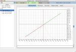
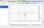
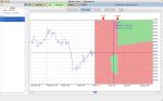
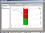
| The chart at right represents the profits and losses for a butterfly strategy if the options would be exercised by their owners. Note that the area of the profit/loss curve around the current price (red vertical line) is red, indicating losses if the stock price does not vary much. If we look at the Exit Chart, we will see a similar curve. The Exit Chart represents the profits and losses if the investor leaves the position. In the case of the Butterfly strategy at right, to leave the position, the investor would have to sell the Call options at the ends and buy back the call options in the middle. |
 |
| The Exit chart (at right) will only tell us part of the story. It will describe the profits and losses for a specific time. However, the value of an option is inversely proportional to the time to expiration. Therefore, the exit chart that you see at a given moment will change with time. There are strategies such as the Calendar Spread (selling an option with a near expiration date and buying another with the same strike price but at a later expiration date) in which the profits occur at a later date: if the investor were to exit soon after using the strategy, he/she would lose, no matter what the underlying asset price. The Time Chart at right shows the same Butterfly strategy shown in the previous charts. |
 |
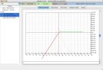
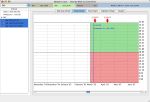
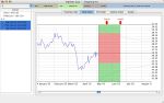
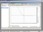
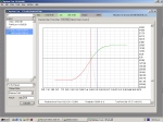
| The graphic at right is the Time Chart, with the break-even points (the line where the green and red areas meet) set for exercising options. The breakeven line is horizontal because the profits and losses when exercising an option do not depend on the time. For example, the profit of a call option by exercising it is equal to the price of the underlying asset minus the strike price minus the option premium paid by the holder. |
 |
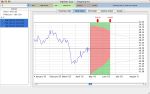
| The Time Chart to the right now shows the breakeven line set for exiting the Butterfly strategy. To change from one view to the other, choose any alternative from the View/Time Chart menu. Note that in this case, the breakeven line is actually a curve and the chances of profiting increase with time. This is because the options that were purchased lose value faster than the ones that were shorted. |
 |
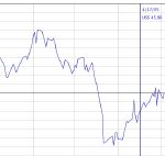
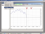
| The first element of the Time Chart is the historical price chart. Although it is true that past performance cannot predict (at least exactly) future stock behaviour, it is very important to keep a reality check that will allow you to see whether your option strategy will achieve profitability or not. For the Butterfly mentioned in this example, the stock would need to vary in the next month in a half in the same way that it did one month ago (when the price dropped below US$45), for the investor to obtain a profit by exercising the options. This is being realistic. The historical prices are downloaded automatically from the Yahoo Finance site and may not appear depending on the underlying asset. |
 |
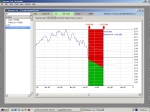
| The second element of the Time Chart are the expiration arrows. These arrows indicate the expirations for the available options of a given underlying asset. In the attached screenshot, you can see that the nearest expiration dates are May 21st and June 18th. The profit and losses areas end at the second expiration date because we chose to work with June 05 options. |
 |
| The third element of the Time Chart are the profits and losses areas themselves. The green areas represent the areas of time and underlying asset price in which the investor will profit and the red areas represent the losses space. Clicking on a chart will reveal a blue line that indicates the selected date and the breakeven point(s) for that particular date. As mentioned before, the beauty of this chart is that it can reveal strategies that are profitable only in the mid-term like the Calendar Spread at right. The green areas represent the location in time and price of the stock for the investor to profit. |
 |
Viewing Exit Strategies Through Time
| As mentioned elsewhere, Options are time-sensitive financial instruments. Without a variation in the price of underlying asset price, the closer to the time of expiration, the less value an option will have. Therefore, it is important to be able to predict the value of your option strategy on a future date to know when to sell (or buy) back the options to the market. |
| Options Czar includes several ways to visualize the future value of your option strategy. In this example, we will simulate the purchase of 5 Put options. The cost of this operation is equal to 100 (the amount of underlying assets per option) times the option price plus the commissions, that are equal to the fixed commission (flat fee) plus the cost per transaction times 5 transactions. Hence, if we decide to sell the Put options today, we would just lose the commissions that we paid for purchasing the Puts and the commissions that we would need to pay to to sell them again. The price of the 5 Puts that we bought would have to increase an amount equivalent to 2 x (flat fee + cost per transaction x 5). |
 |
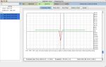
| Since the price of the Put increases when the price of the underlying asset decreases, we can see just how much it would need to drop to break even (i.e. not win nor lose) in the Exit Chart. This chart shows (at any given time) how the profits and losses behave as a function of the underlying asset price. Note that in this example, we chose options that were out of the money (i.e. the Put strike price was lower than the current asset price) since these options lose value more quickly. |
 |
To explain how the option value decays with time, we take a look at the Time Chart. We select the Put options and make sure that the "Exit Profits and Losses" option is selected in the View -> Time Chart menu. We can see that the breakeven price decreases with time. If we click on the Time Chart and move to the Exit Chart, we can take a look at the breakeven price. When we do that several times, we learn the following:
- On June 20th, the break-even price is US$ 18.46
- On July 5th, the break-even price is US$ 17.65
- On July 18th, the break-even price is US$ 16.76
|
 |
Even more important than the breakeven price is to know how much you lose with the Put options in your hands when the underlying asset price doesn't vary. This information can be seen through the Exit Chart.
- On June 20th, you would lose $98.43 if you sold back the Put options.
- On July 5th, you would lose $199.00.
- On July 18th, you would lose $267.10.
|
 |
| Time decay of options also enables the use of strategies like the Calendar Spread, in which an option is sold and another identical option is purchased but with a later expiration date. As can be seen in the Time Chart to the right, profits will appear when the value of the option that was sold decreases more rapidly than the one that was bought. This option has a very low risk as in case the buyer of your first option wants to exercise it, you can pay with the income you receive with the one you bought. |
|
Using The Strategy Maker
| One of the most important features in Options Czar is the ability to recommend an options strategy (combination of options and stock operations) based on the user's predicted underlying asset behaviour. In other words, there is an optimal strategy for when the asset price increases, for when the asset price drops and even for when the asset price remains the same. The Strategy Maker accepts as input the amount of cash the investor is willing to spend and the type of success criteria that he/she will use (maximize profits, minimize risk or obtain the best average profits). |
| The following example shows how this is done. We first take any asset either from the Asset table list (in case we're using End-Of-Day data) or pull the asset data from the CBOE web page (in case we're using free data) and load it's data onto the options chain table. |
 |
| Once we have done this, we can go to the Time Chart and choose "Strategy Maker" from the Tools menu. We can also choose "Strategy Maker" from any place in the application and it will take us to the Time Chart tab. We can see that to the left a small section has appeared with a pull-down menu, a place to add the amount of cash we will invest and the button to get everything moving. |
 |
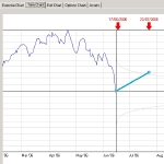
| In this example, we look at the historical data and make a wild guess that the stock price will bump back up by July 22nd, which happens to be the expiration date in July. Therefore, we click on a chart and a blue point will appear. Seconds later, a line that joins the current price with the blue point appears, too. |
 |
| Now that we have defined our predicted trend, we decide that we want to choose the option strategies that maximize the profits at any given point in time. We also decide to invest $2500 on these strategies. Please note that we have previously defined a maximum loss of US$1000 in the first tab of the preferences window. Statistically speaking, within a plus/minus variation of 2 times the volatility of the stock price (which covers 95.44% of the probable prices), the chosen strategy will not allow us to lose more than $1000. |
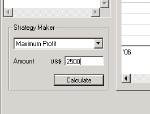 |
| Once we click on the "Calculate" button, we will see that the application starts thinking. After it finishes thinking (actually it was calculating), it delivers a list of the best option strategies in a new pull-down menu and selects the first one for us. Please note that the more options a chain has, the longer this calculation will take. Please note that the Strategy Maker uses the Exercise Profits and Losses for calculating. A future Options Czar version will use both. |
 |
Every time we select a new strategy from the menu, it will show up in the Time Chart. In short, Options Czar allows you to design options strategies based on:
- The underlying asset (stock or index) of your preference.
- The amount of cash that you'll want to invest.
- The maximum amount of cash that you're willing to lose.
- The type of success criteria.
- Your expectation for the underlying asset in the next months.
|
 |
|